Introducing the 2025 Dulux Colour Forecast:
Uplifting Shades for a New Era of Design
As we move into 2025, the need for spaces that reflect peace, comfort, and optimism has never been greater. Enter the Dulux Colour Forecast 2025, a collection of carefully curated palettes that bring a fresh perspective to home interiors. Each palette in this year’s forecast has been designed with intention, responding to the uncertainties of recent times and offering a path to joy, reflection, and calm.
Let’s explore the three main colour stories from the 2025 forecast—Emerge, Recollect, and Still—and see how these tones can inspire your next design project.
1. Emerge Palette: Uplifting Pastels for Everyday
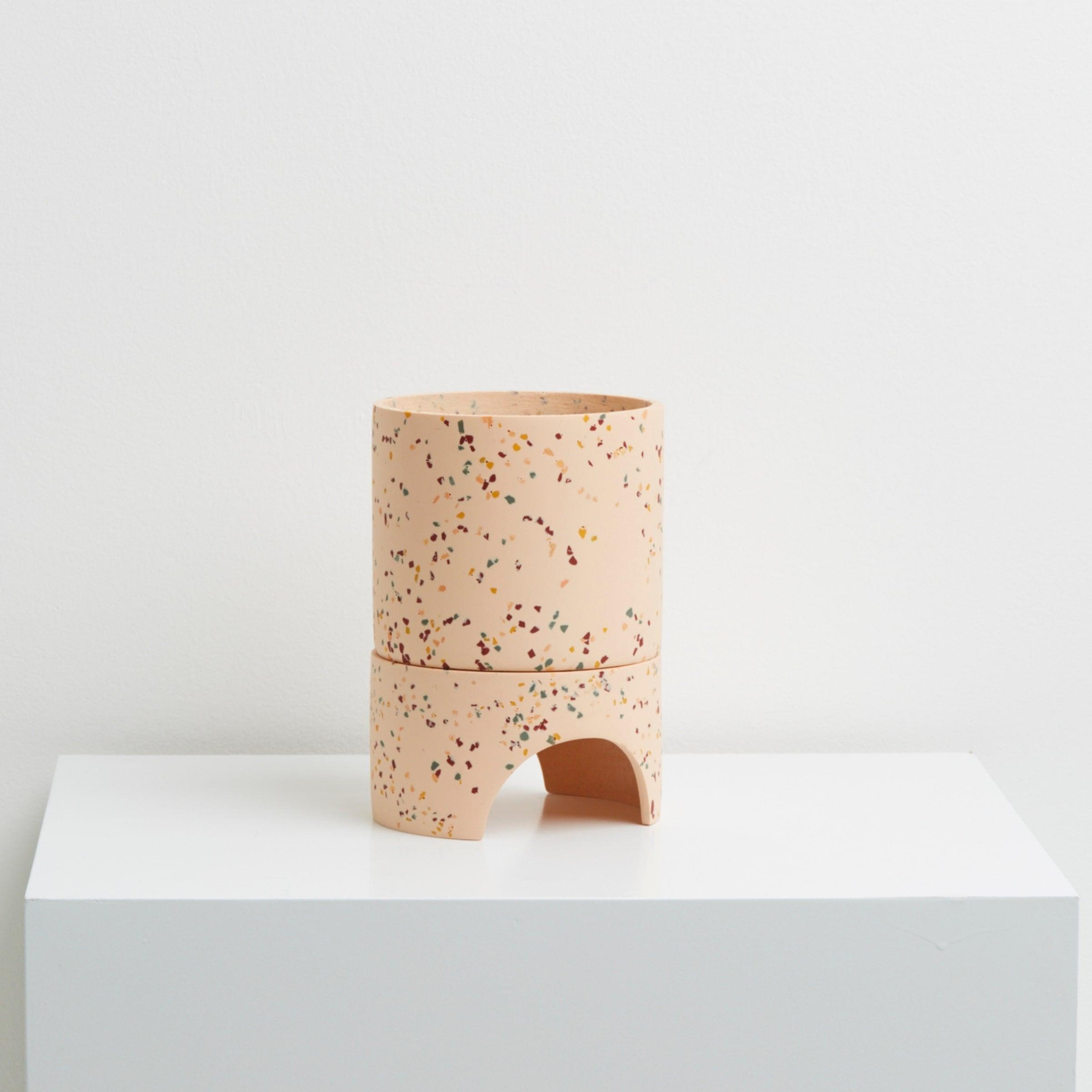
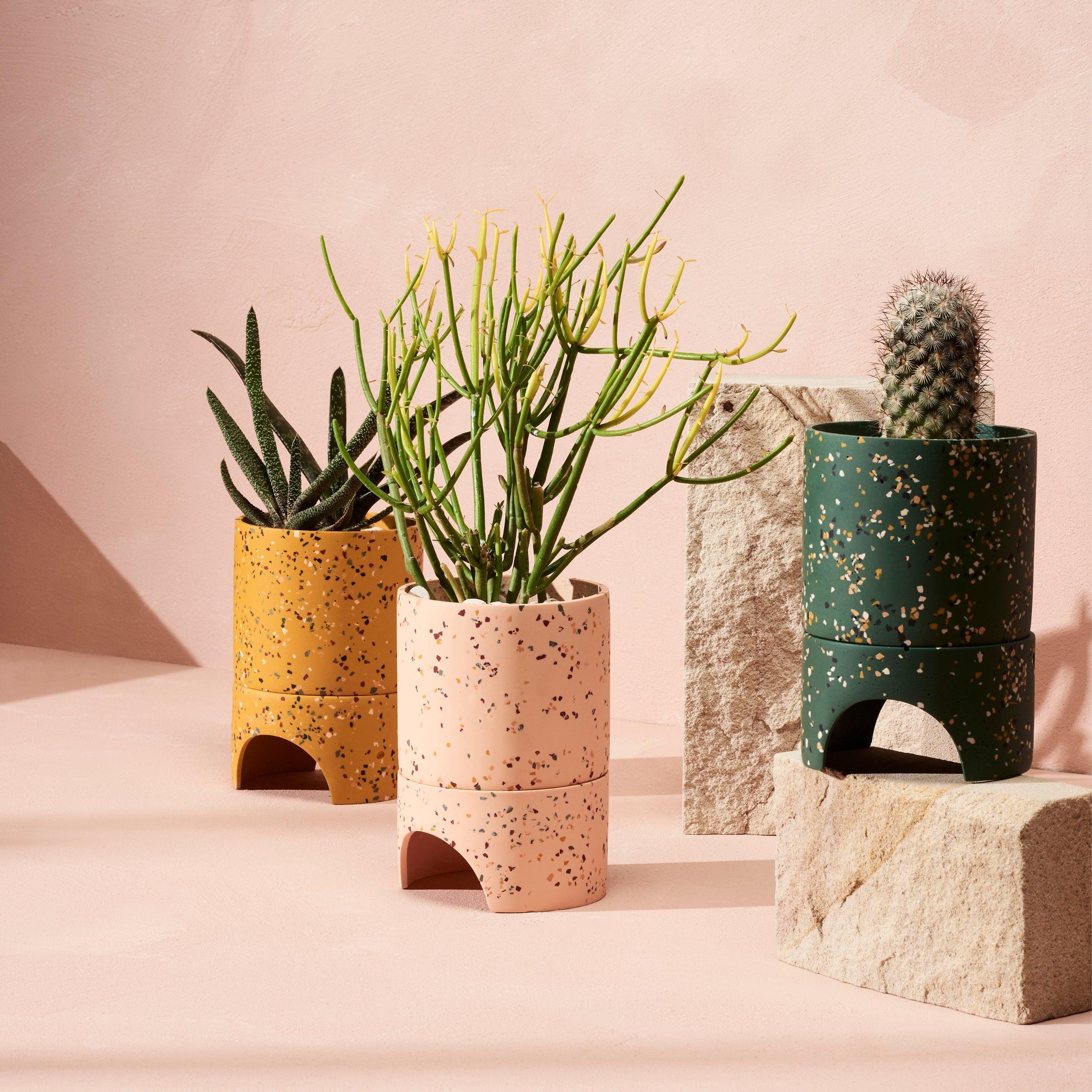
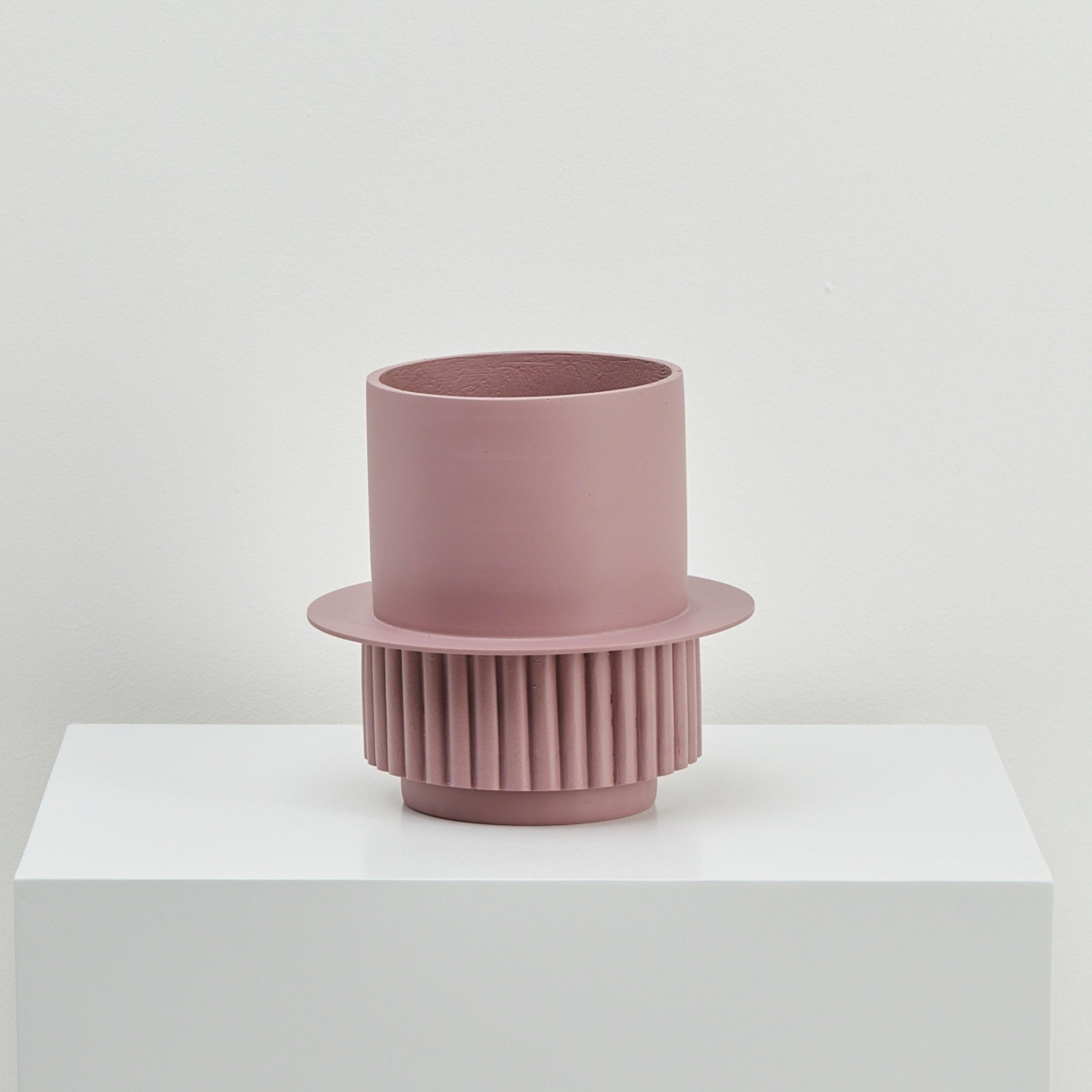
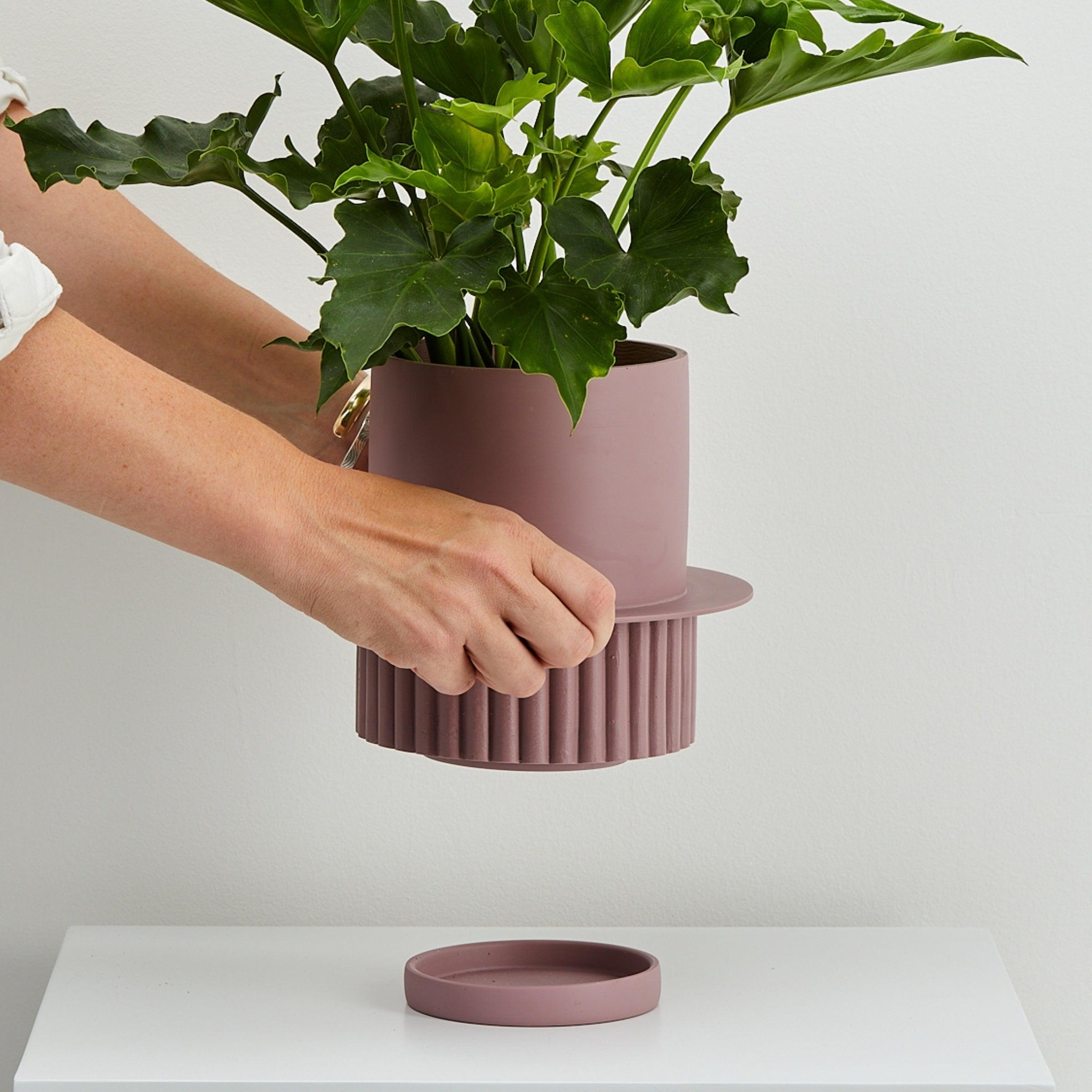
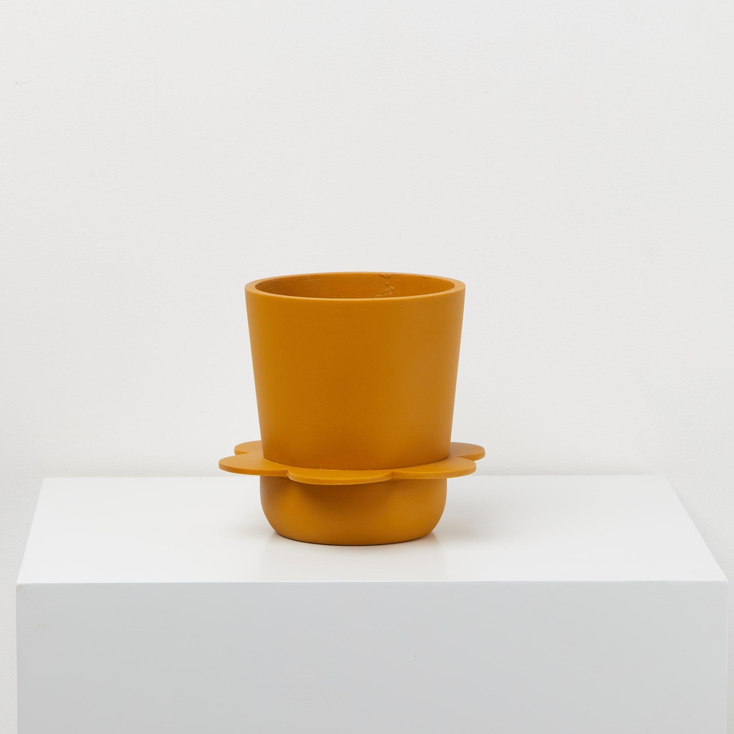
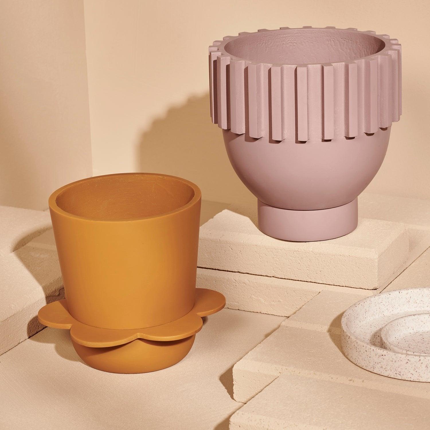
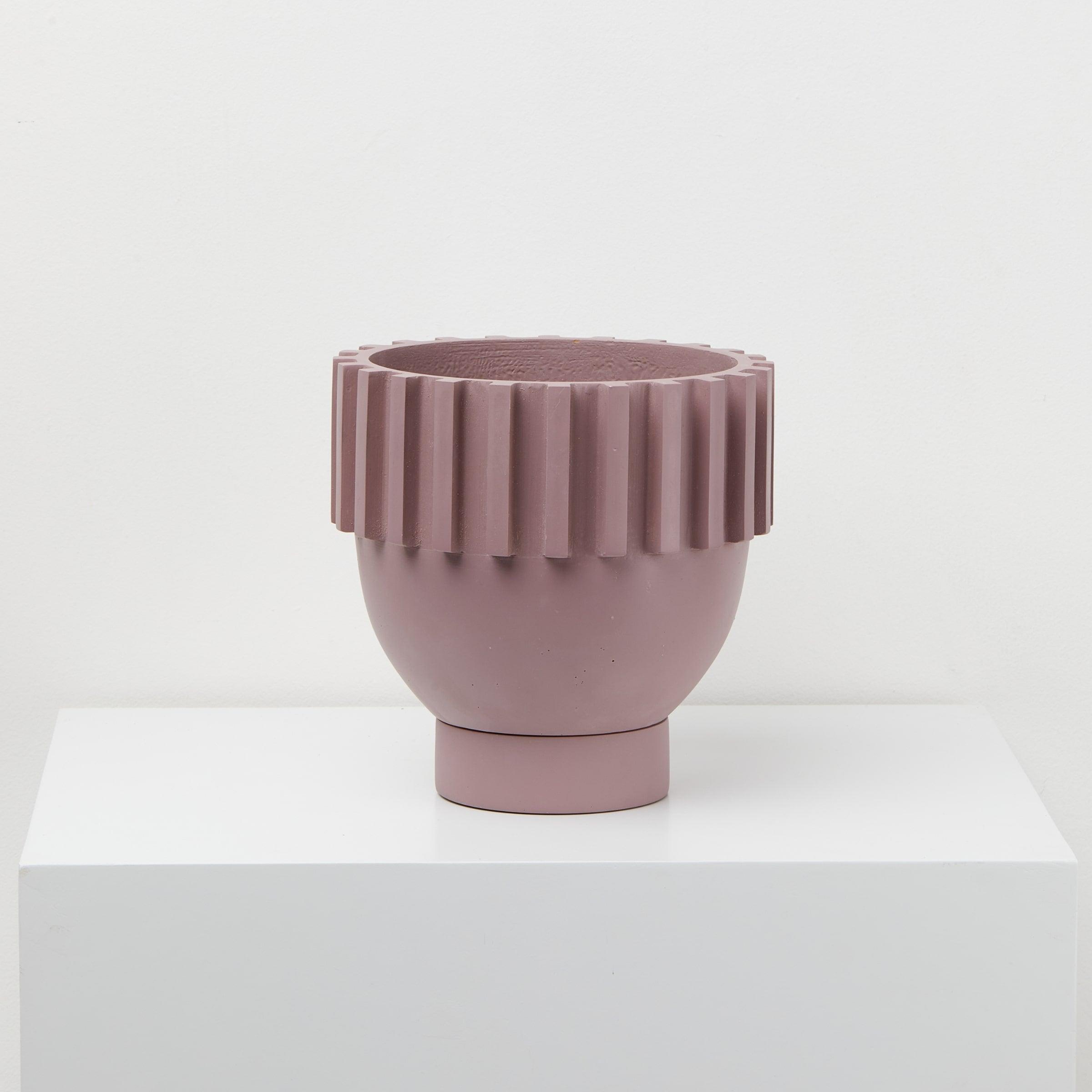
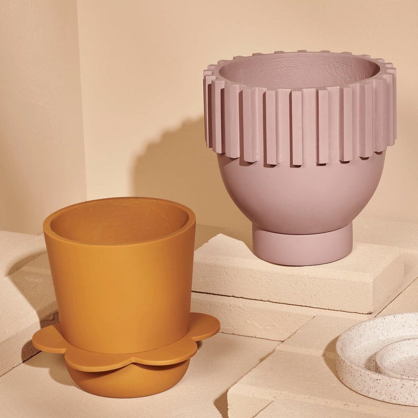
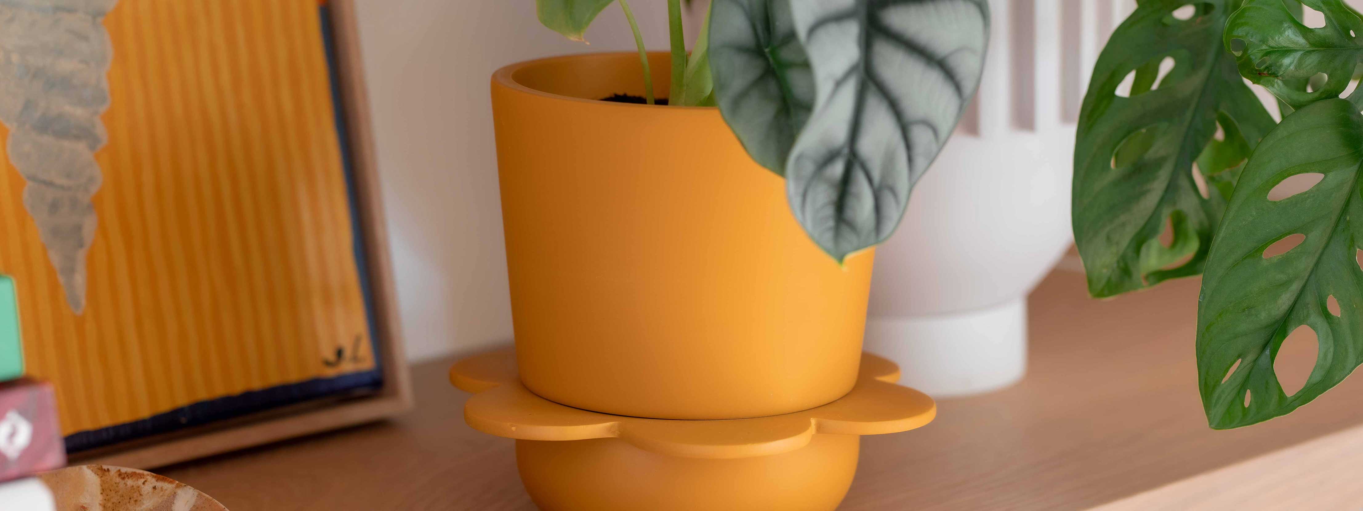
After years of unpredictability, the Emerge palette offers a breath of fresh air, filled with soft, comforting hues that don’t overwhelm. This uplifting palette features paired-back pastels, including delicate greens, mauves, and a bold deep red that adds an unexpected layer of sophistication.

The Emerge palette is designed to introduce joy into our living spaces in a way that feels gentle and approachable. Soft greens like sage and pistachio bring a connection to nature, while muted mauves and blushes infuse a sense of calm. For those wanting to add a touch of warmth, the deep red acts as an accent, grounding the lighter tones and adding depth without overwhelming the space.
How to Style the Emerge Palette:
Consider incorporating these pastel shades into spaces where you seek lightness and energy. In living rooms, kitchens, or bedrooms, soft greens and mauves can be used on walls, while the deep red can add focus through accents like cushions, rugs, or feature walls. This palette encourages experimentation, allowing homeowners to add joy to their home in subtle yet impactful ways.

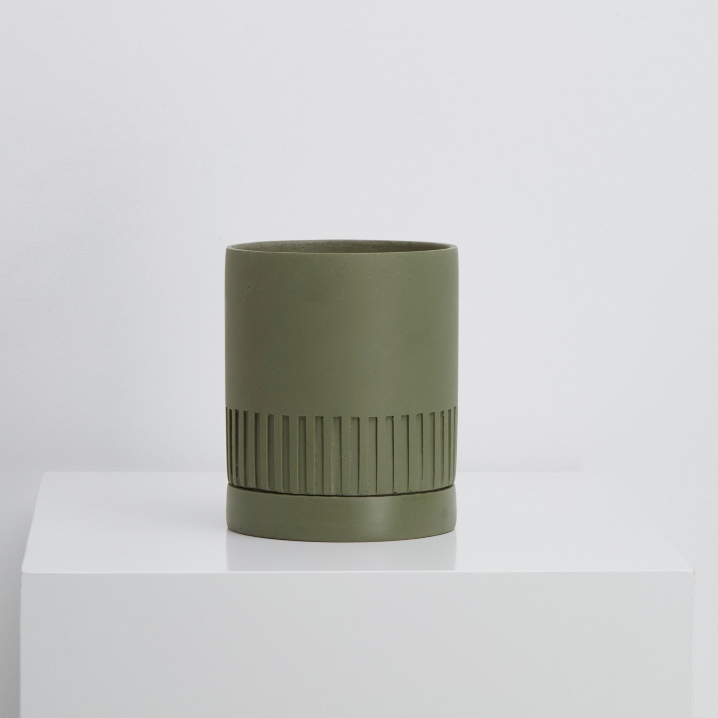
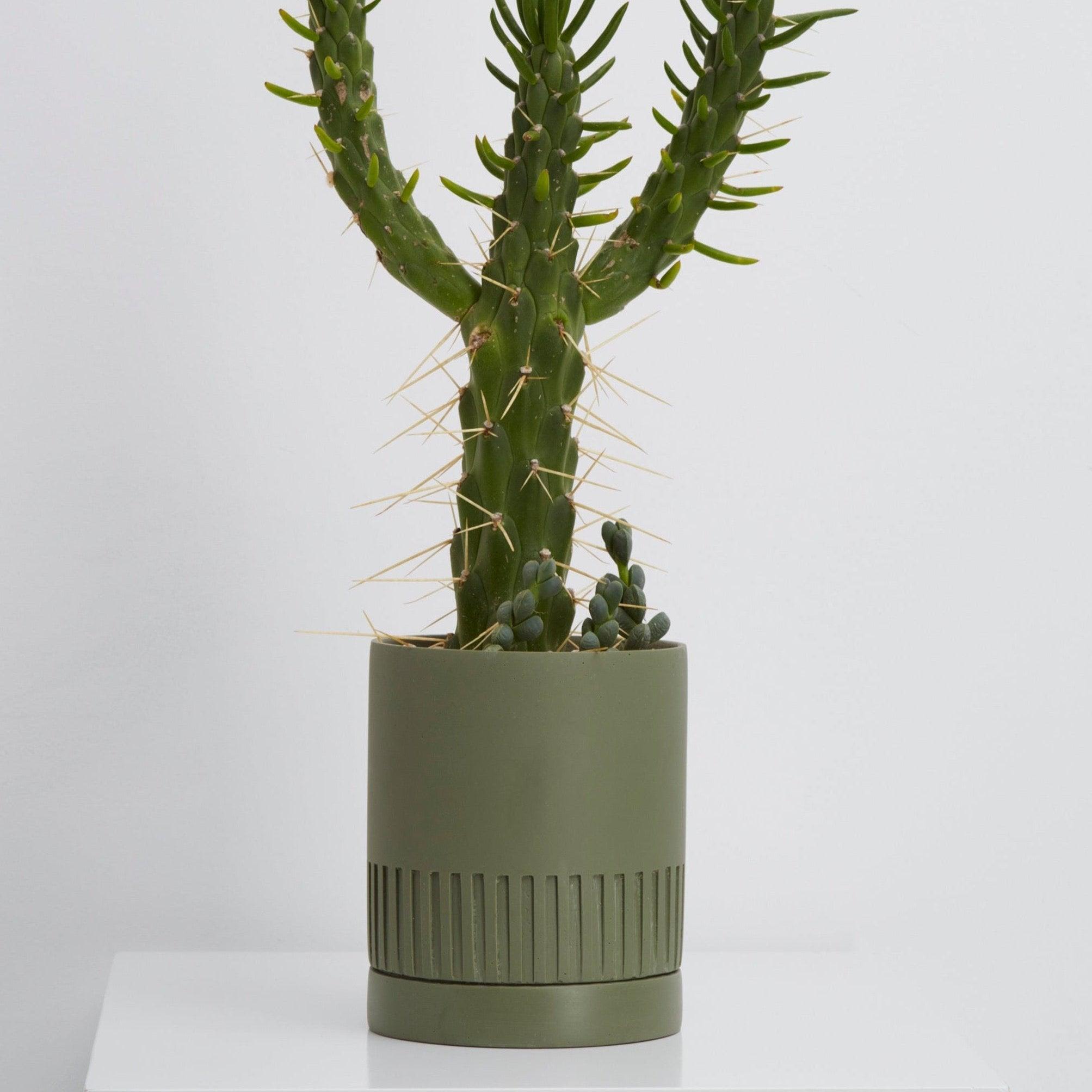
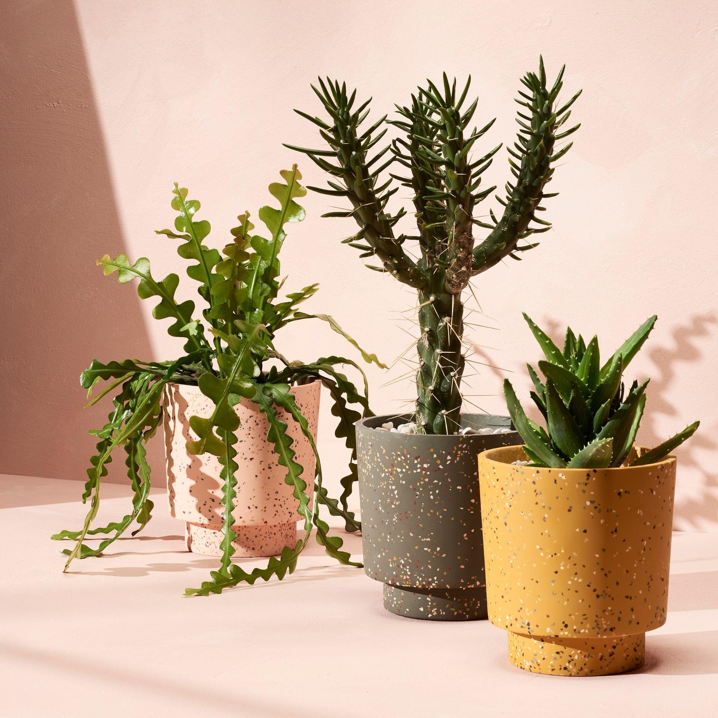
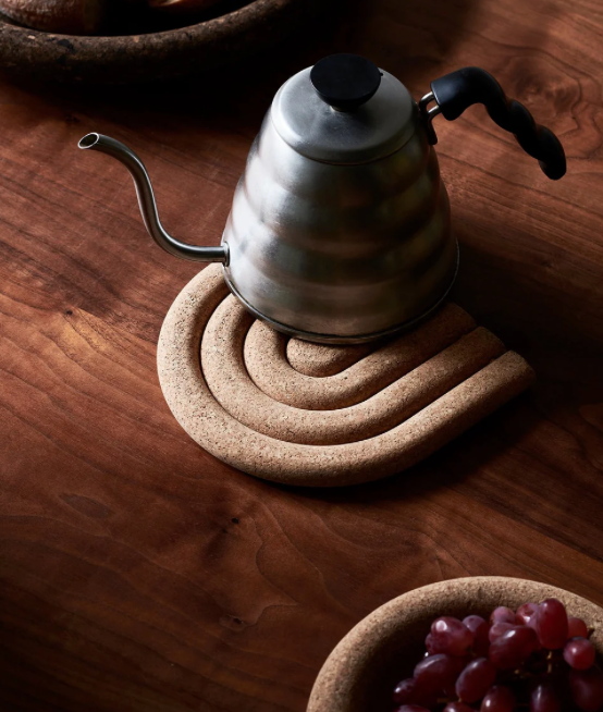
2. Recollect Palette: Nostalgia and Comfort with Moody Greens and Rich Wine
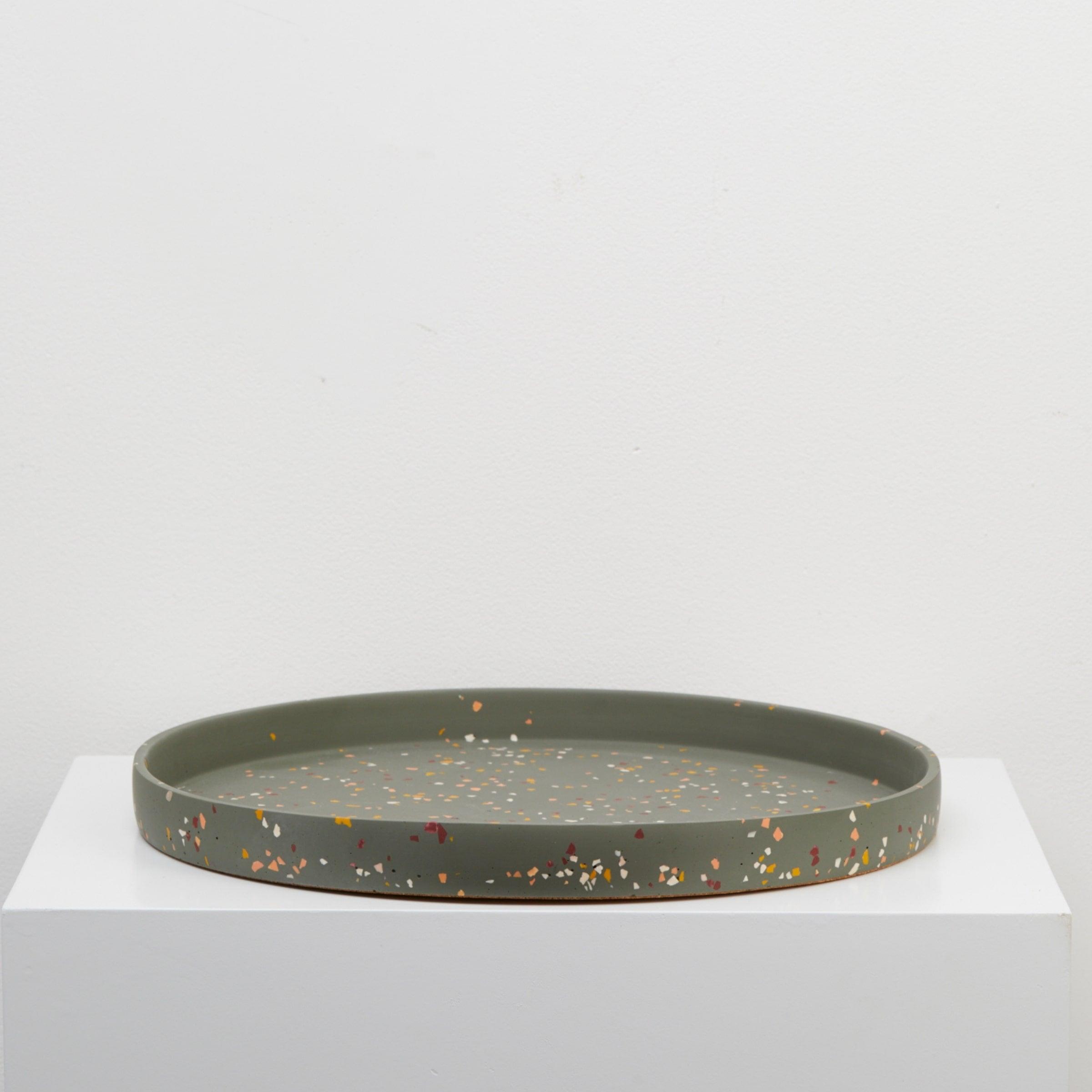
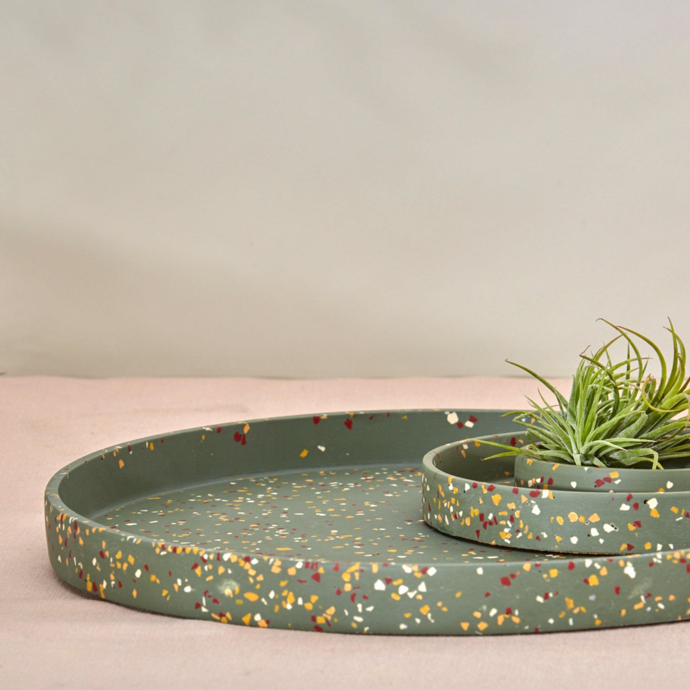
In response to the desire for comfort, security, and reflection, the Recollect palette leans into moodier, more nostalgic tones. Yellow-based greens, deep olive, and rich wine shades are at the heart of this collection, evoking sophistication and a sense of warmth.
The Recollect palette draws inspiration from nature’s deeper, more grounded colours, offering a harmonious blend of shades that feel timeless yet modern. Deep olive greens and soft moss tones anchor this palette, while the wine shades add a layer of richness and luxury. Together, these hues create spaces that feel safe, comforting, and cocoon-like—ideal for rooms where you want to relax and unwind.

How to Style the Recollect Palette:
These moody colours are perfect for creating intimate, cozy environments. Consider using them in bedrooms, dining areas, or reading nooks. Walls painted in deep olive or wine can make a bold statement, while yellow-based greens and neutral accents soften the look. Textures like velvet, wool, and wood pair beautifully with these colours, enhancing the palette’s nostalgic vibe.

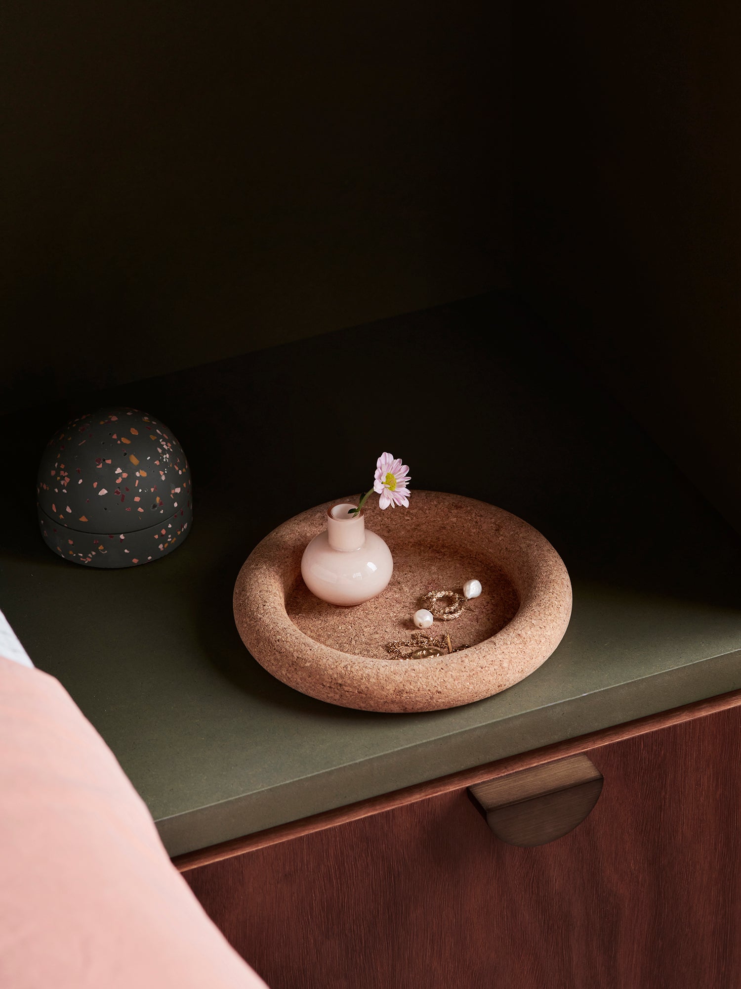
3. Still Palette: Calm and Tranquillity in Subtle, Neutral Tones
For those seeking a slower pace and moments of mindfulness in their home, the Still palette is the answer. With its calming effect, this palette uses soft neutrals and muted tones to create spaces that feel nourishing, grounding, and restful.
The Still palette is composed of whispery greys, pale beiges, and soft browns, all working together to foster an environment of quiet serenity. These shades are designed to blend seamlessly into any space, offering a sense of continuity and peace. With their subtle presence, the colours in the Still palette allow your mind to relax and your home to feel like a sanctuary.

How to Style the Still Palette:
Use this palette to create peaceful, minimalist interiors. It’s perfect for bedrooms, bathrooms, or meditation spaces, where the goal is to unwind and disconnect. Incorporate natural materials like linen, rattan, and stone to enhance the earthy, calm nature of the Still palette. If you crave a little more depth, you can layer in soft, natural greens or blues, but the beauty of this palette lies in its restraint.

A Reflection on Colour for 2025
The Dulux Colour Forecast 2025 offers a thoughtful response to the world’s current mood. Each palette reflects a different emotional need, from joy and optimism to reflection and tranquillity. Whether you’re looking to bring a sense of lightness to your home with the Emerge palette, create a cocoon of comfort with Recollect, or foster a sense of calm with Still, this year’s colours allow you to express yourself in a way that feels authentic and nurturing.
No matter which palette speaks to you, the 2025 Dulux Colour Forecast encourages us all to be intentional about the spaces we create and the moods we set within them. Whether you’re planning a full home makeover or a subtle refresh, these colours offer the inspiration needed to make your home a place of comfort, beauty, and joy.
Ready to Embrace 2025’s Colour Trends? Explore how the Dulux Colour Forecast can transform your home, and get inspired by the possibilities these palettes offer.
Credits: Dulux Colour Forecast
Styling & AD Bree Leech Dulux Colour Forecaster & Stylist
Image Lisa Cohen