Colours that currently resonate
Colours, colours, colours....
While it's unavoidable to be distracted by what's in or on trend it's important to try to choose decorative home objects that will transcend trends.
We believe your home objects should resonate with you and therefore be pieces you love for years to come.
I personally struggle to work with cool colours. I'm immediately drawn to warm colours and find them visually pleasing. It is certainly reflected in the Capra Designs colour palette and even the colours I choose to wear.
That said I'm always looking to balance the warm with a complimentary colour.
Below we’ve selected a range of colours that inspire me.
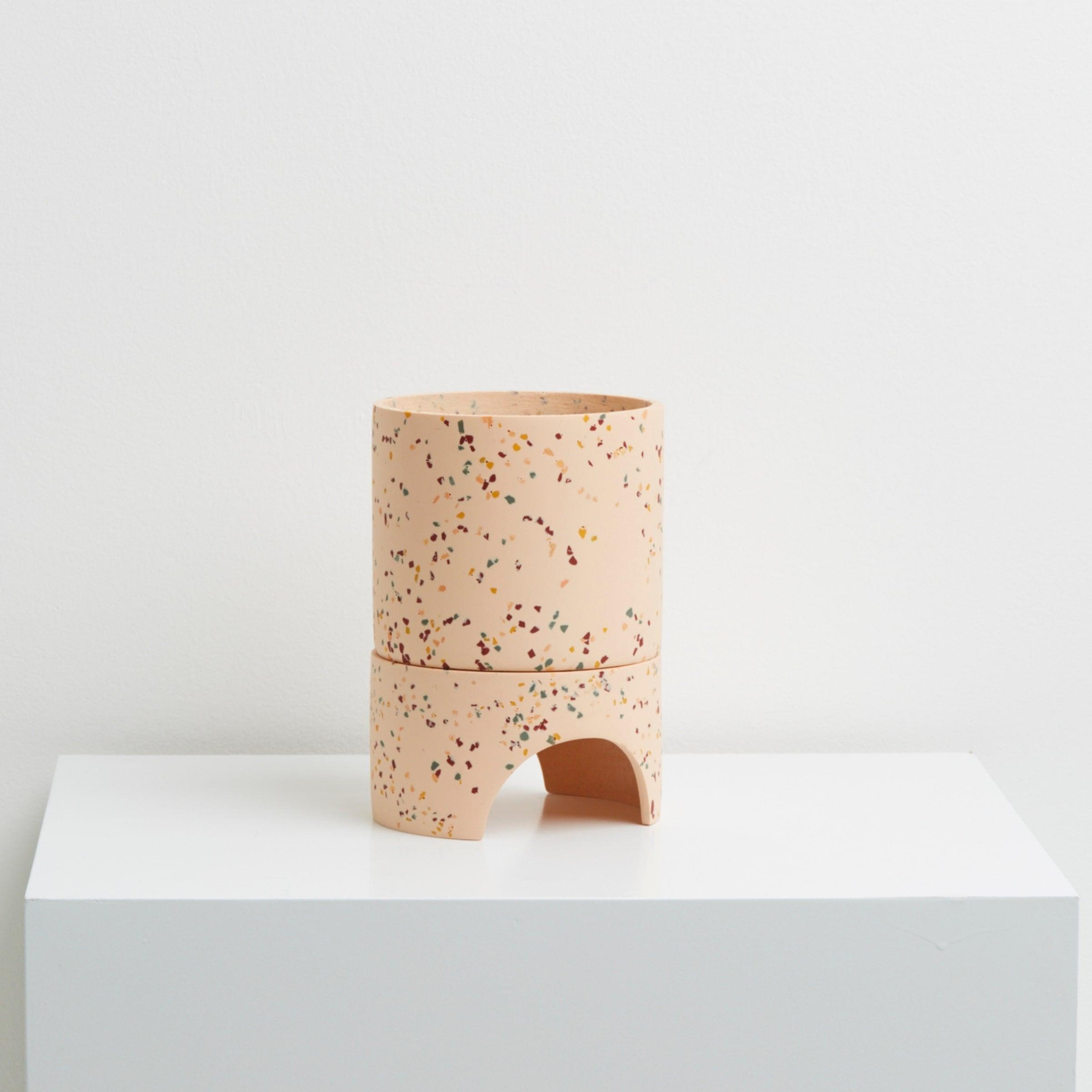
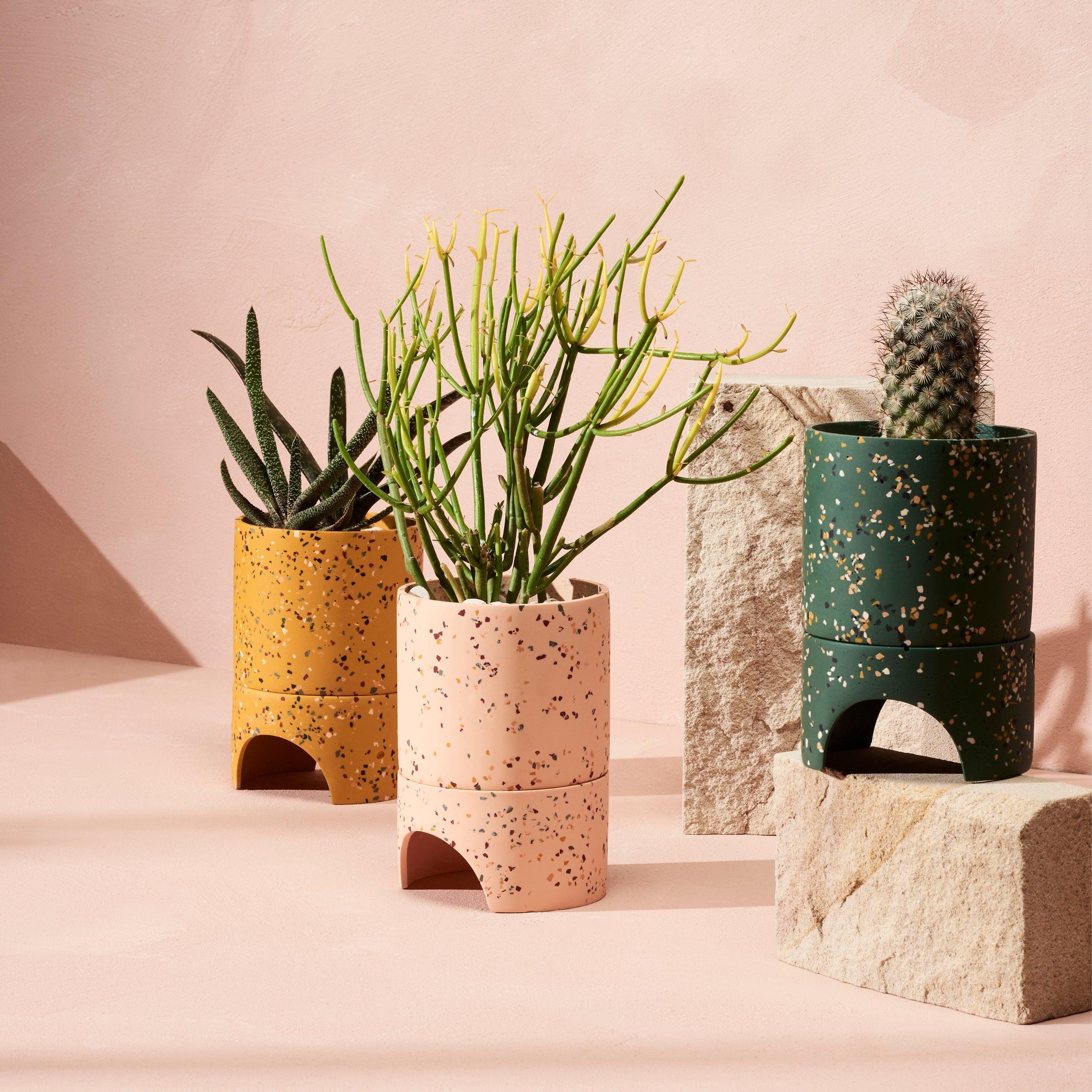
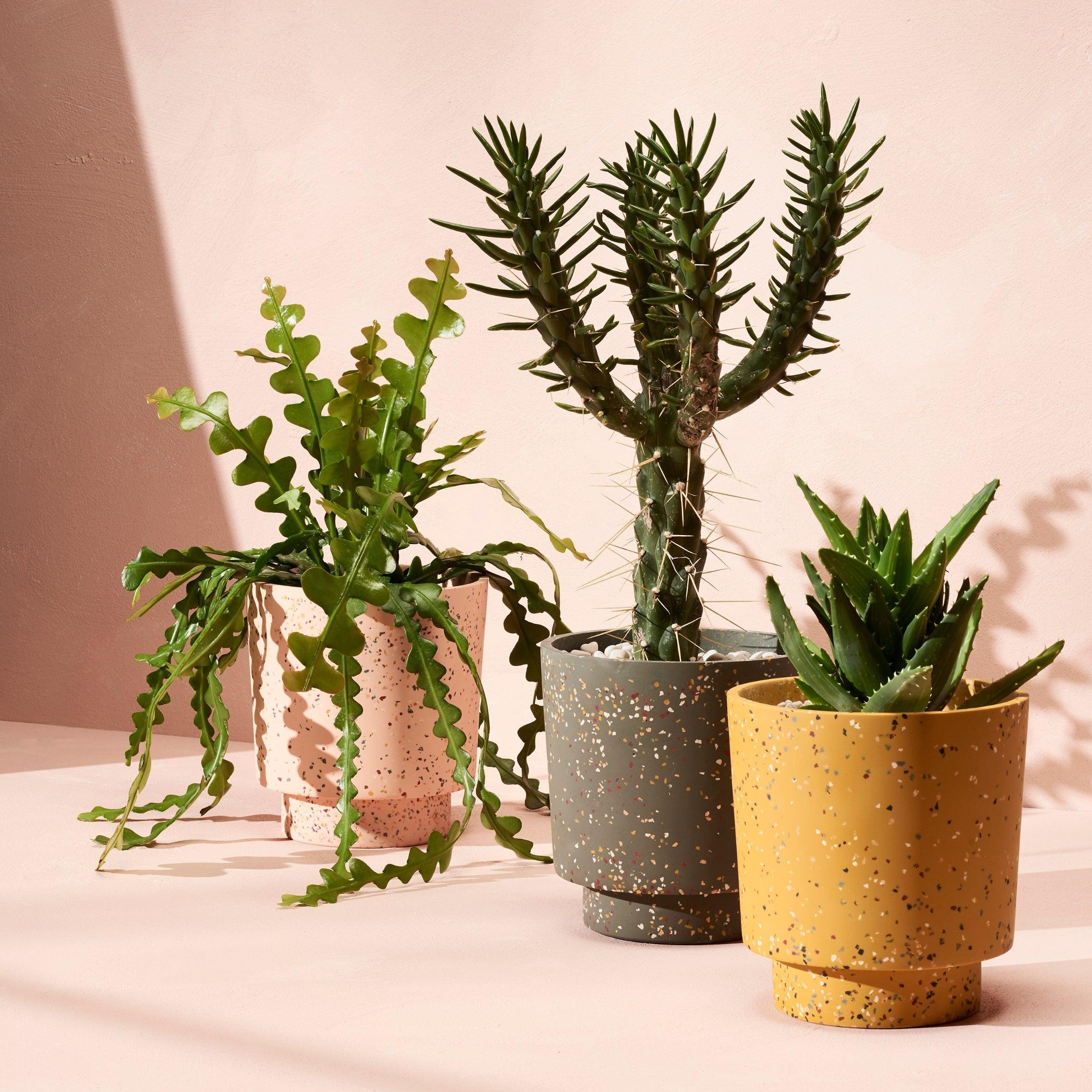
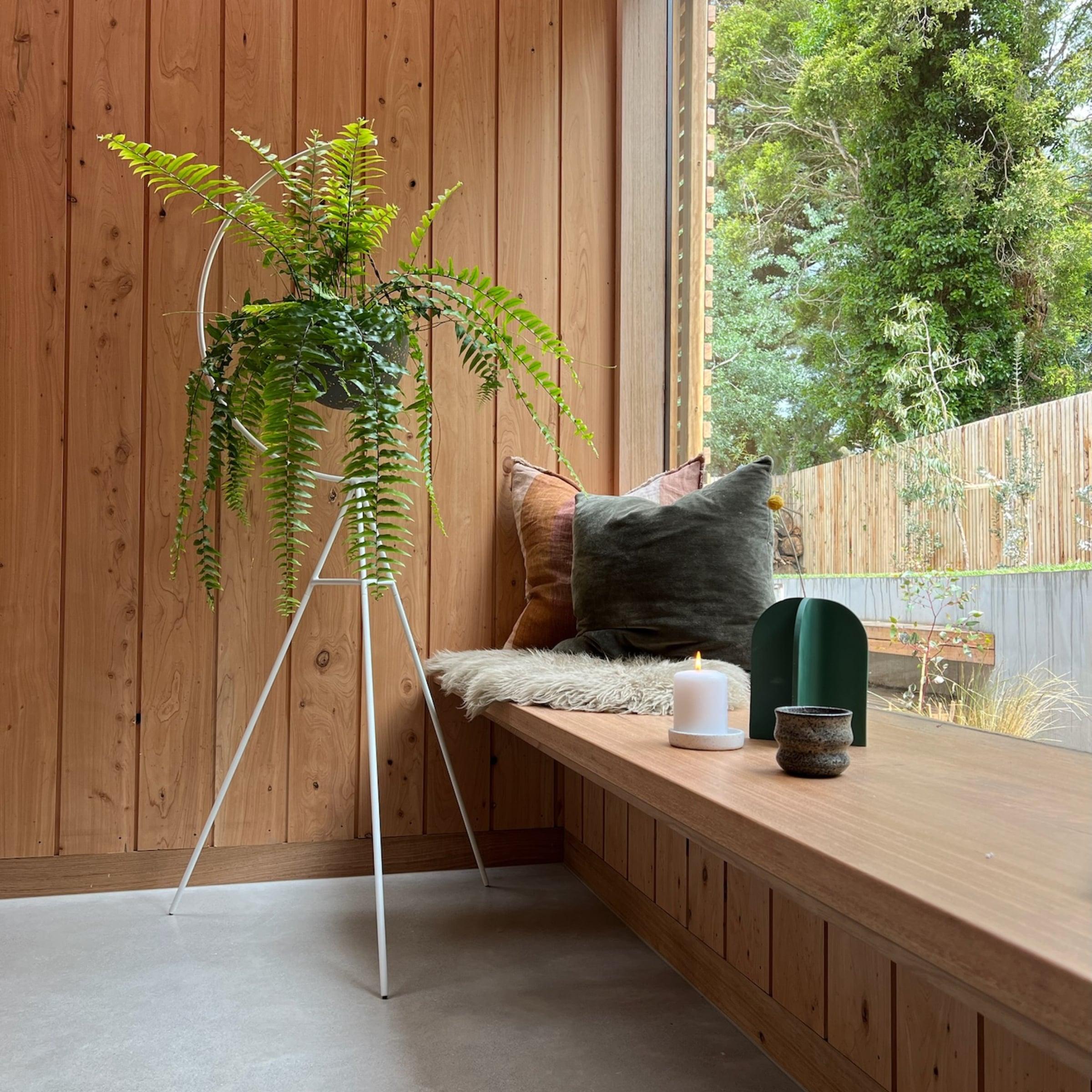
Warm pastels
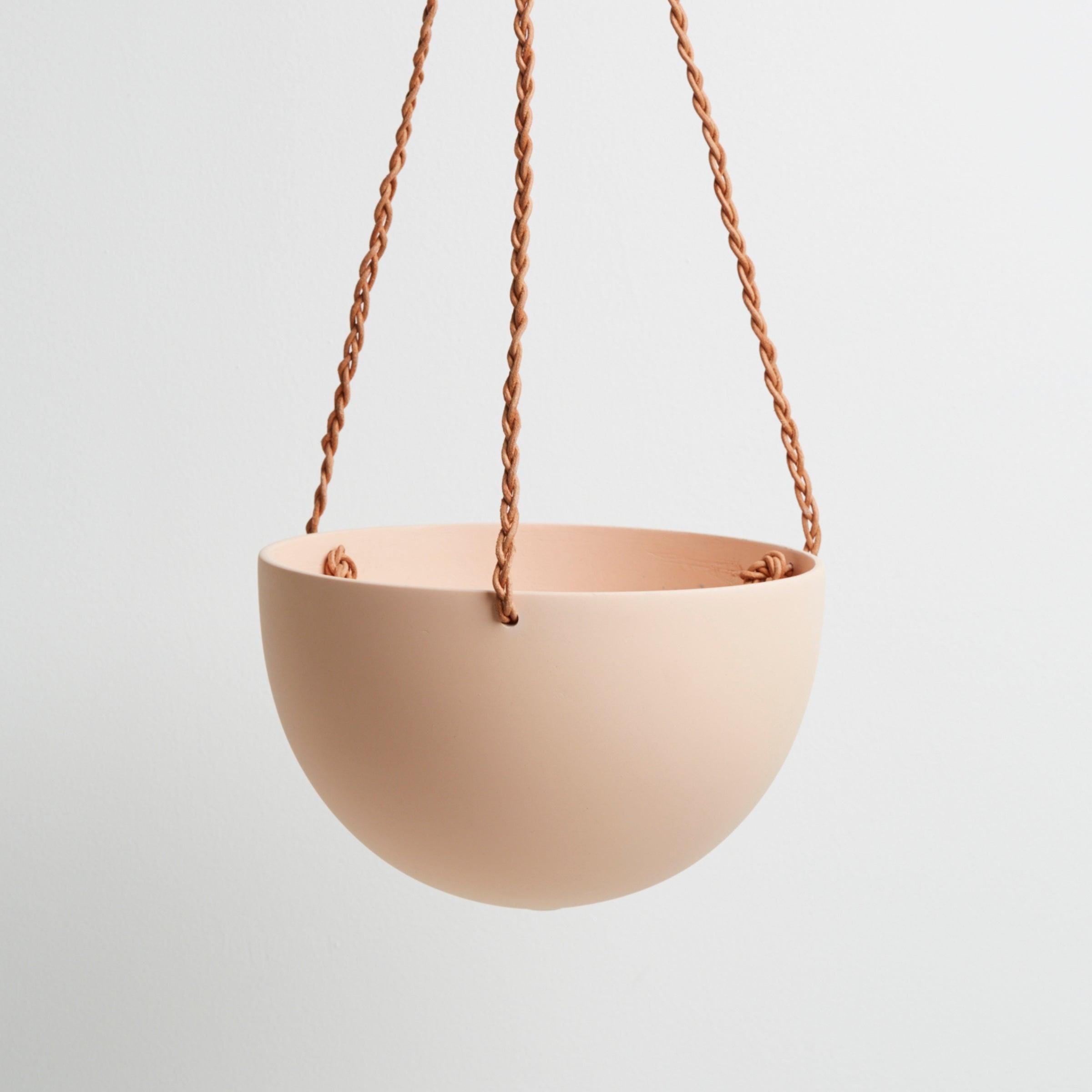
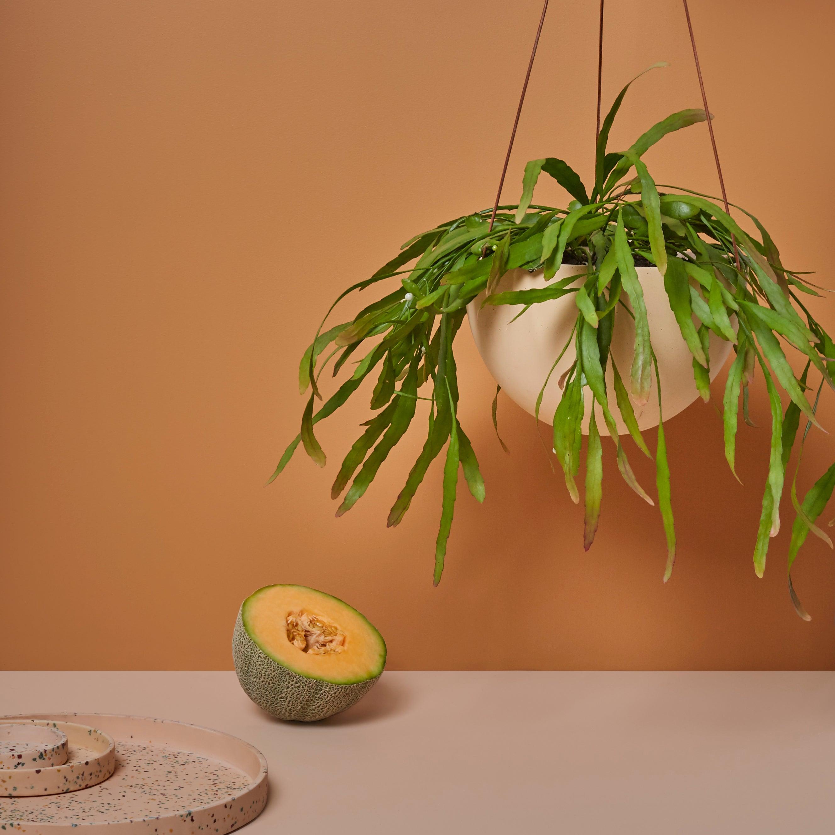
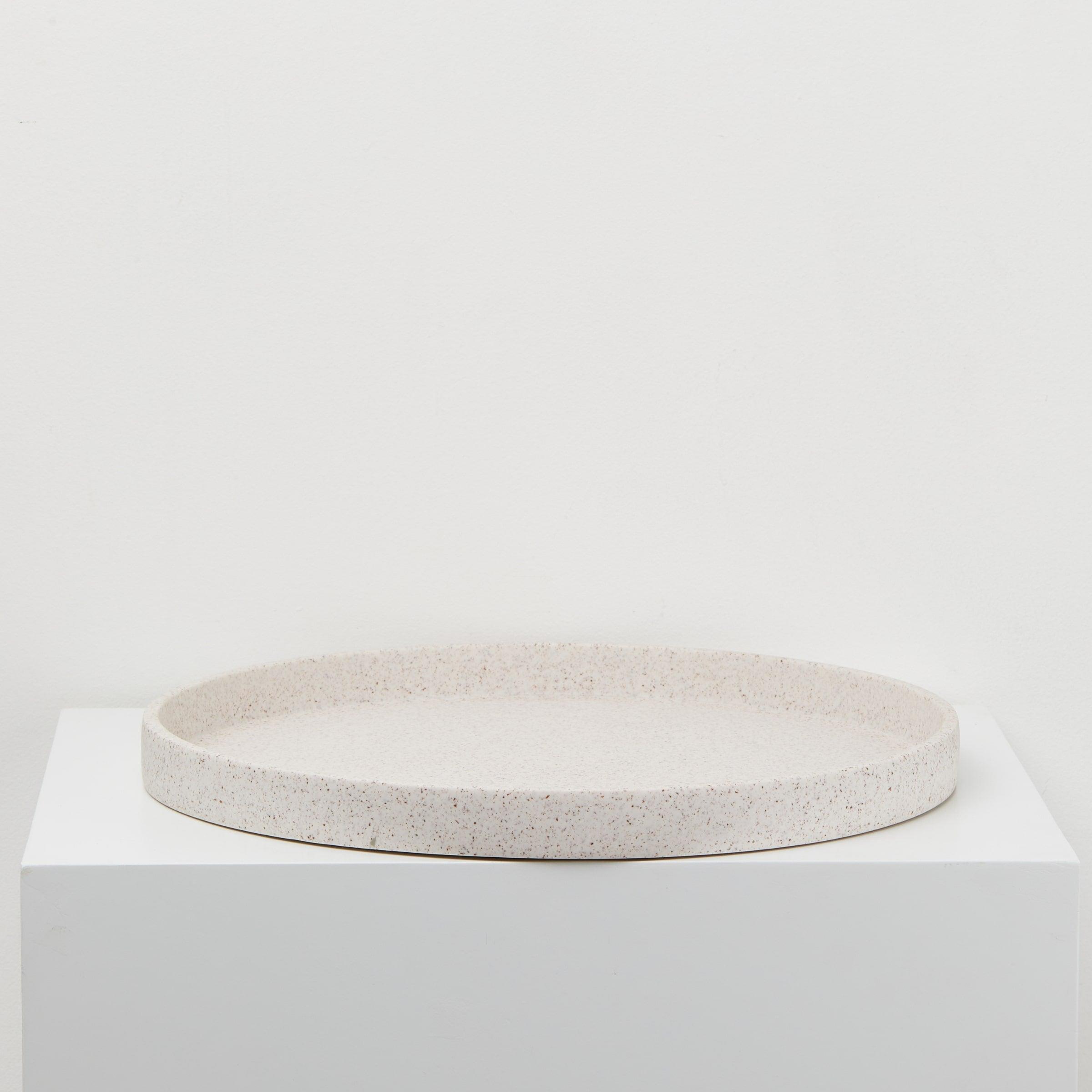
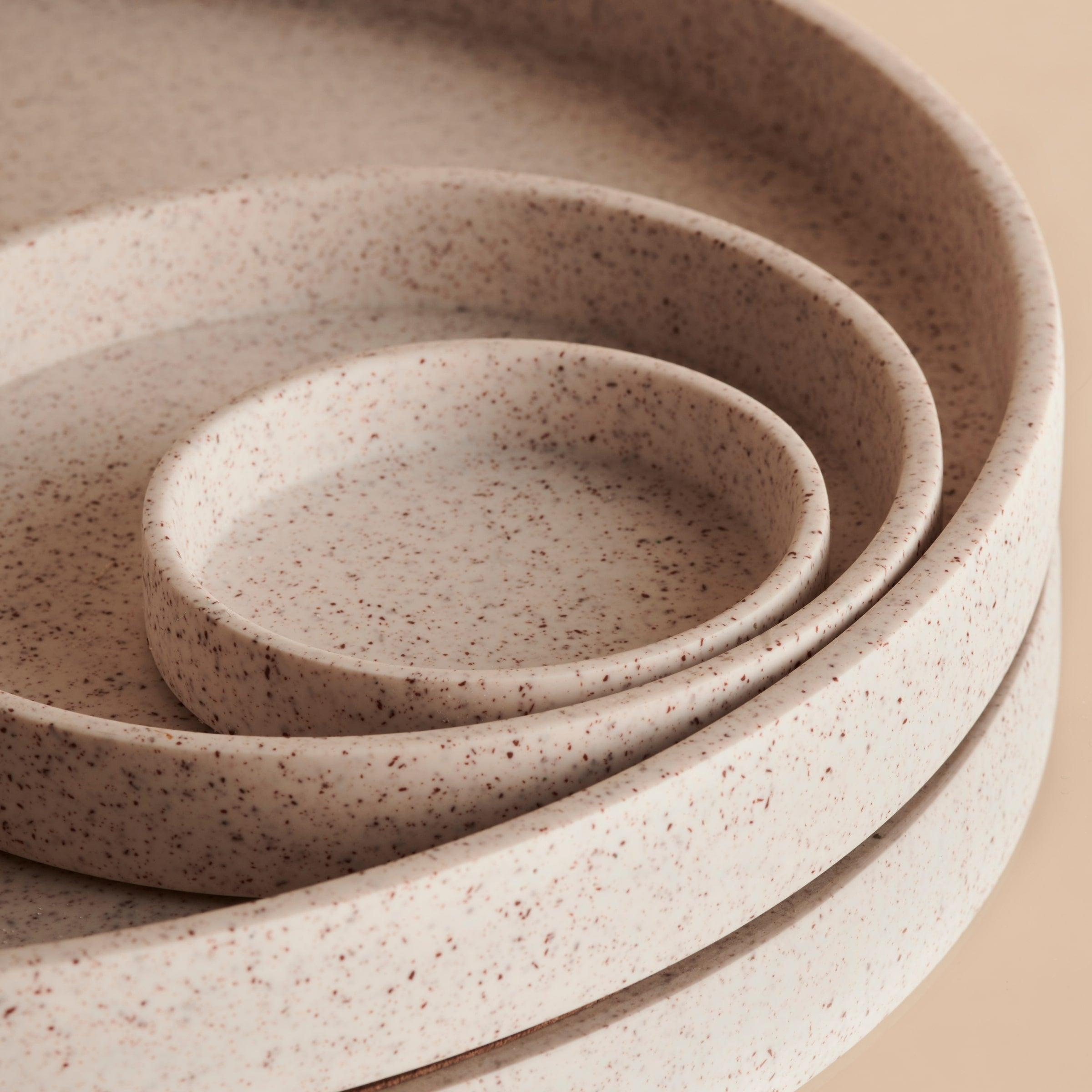
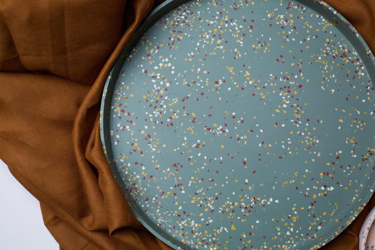
Warm-toned pastel colours can help shoo away the visual cold by bringing a touch of warmth to a room. From earthy terracotta to soft pink, we love the addition of pastel tones. A warm-toned pastel piece can offer a pop of colour to a monochrome room, without being too intense or zany. Colours such as ceramic orange and pale pink also work well with a myriad of colours from dark greens through to greys.
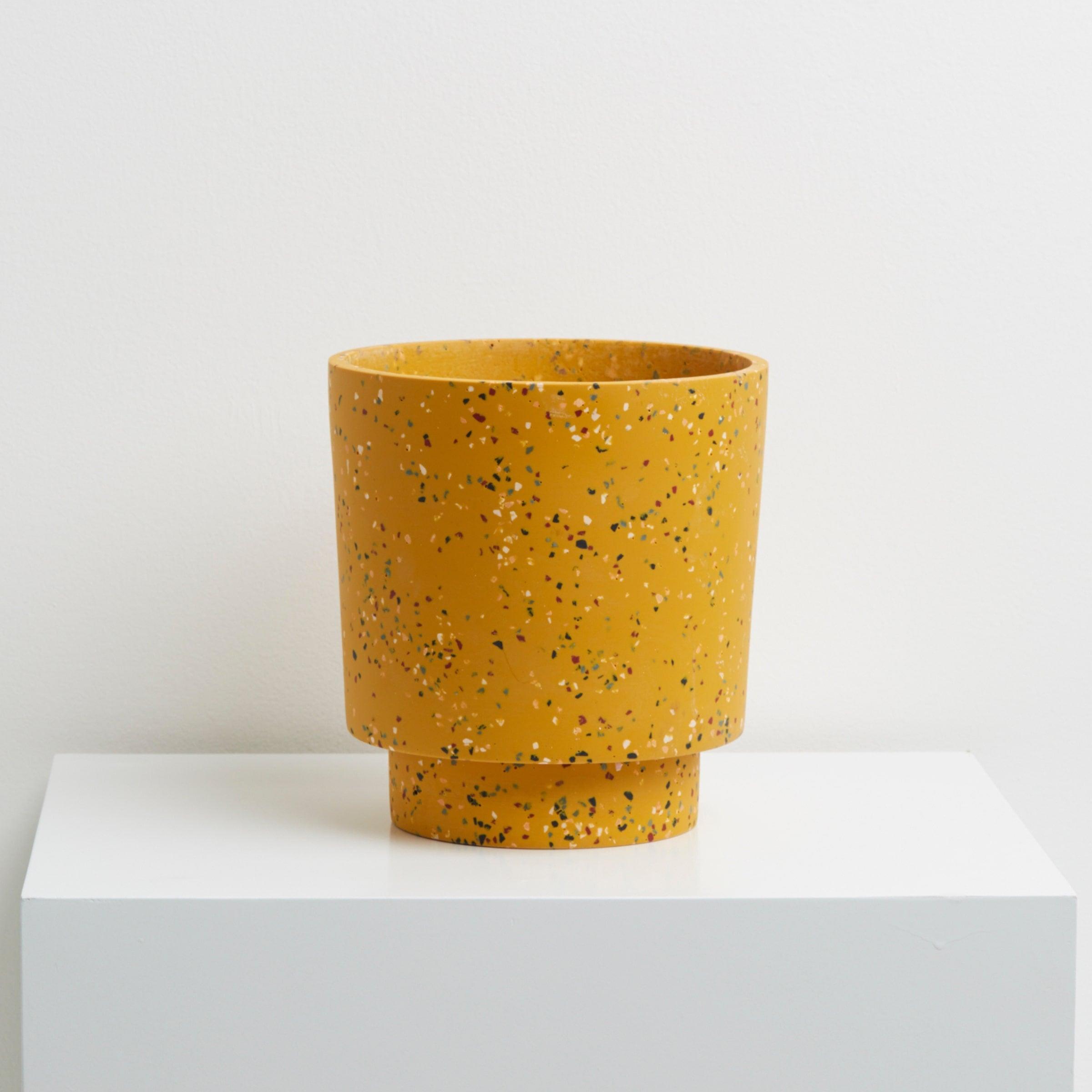
Ochre
For those looking for a bright splash of colour, gorgeous ochre could be an option. Resembling a mustard yellow, the brightness of this colour can be good for rooms that are missing a feature piece. Due to its tendency for complementing dark greens, this colour works fantastic as a plant pot, and can be placed against a large range of background colours from monochromes to deep reds and royal blues.
Navy
Blues are often associated with cooler temperatures, and navy colours can be a great way of incorporating a subtle blue-tone (cool tone) into a room. A navy throw over a light-toned couch can be a simple way to add a winter feeling to a room. Navy works well with many colours, including browns, greens, pastels and dark reds, and it can be an alternative for those who wish to add some colour to a room without it being too eye-catching.
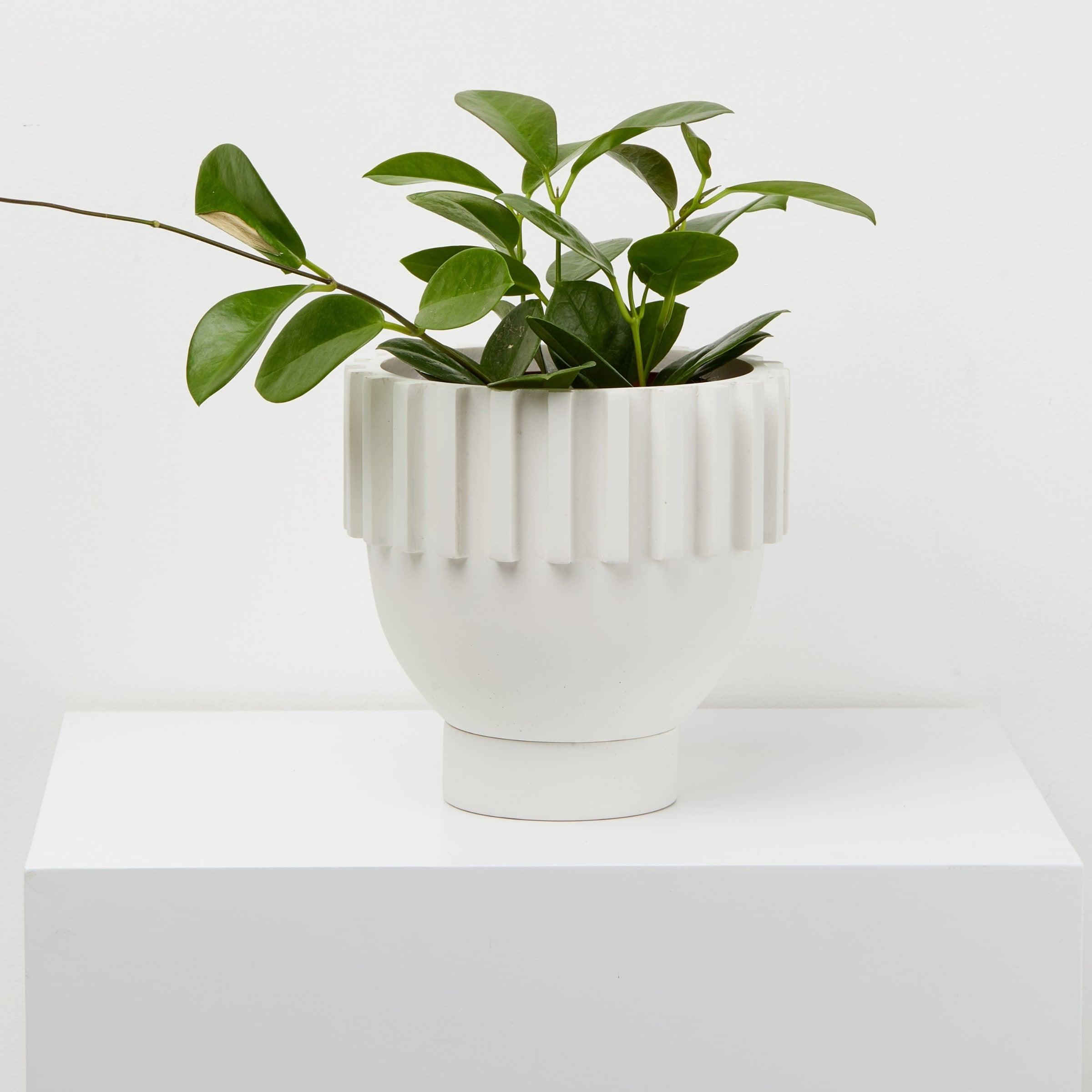
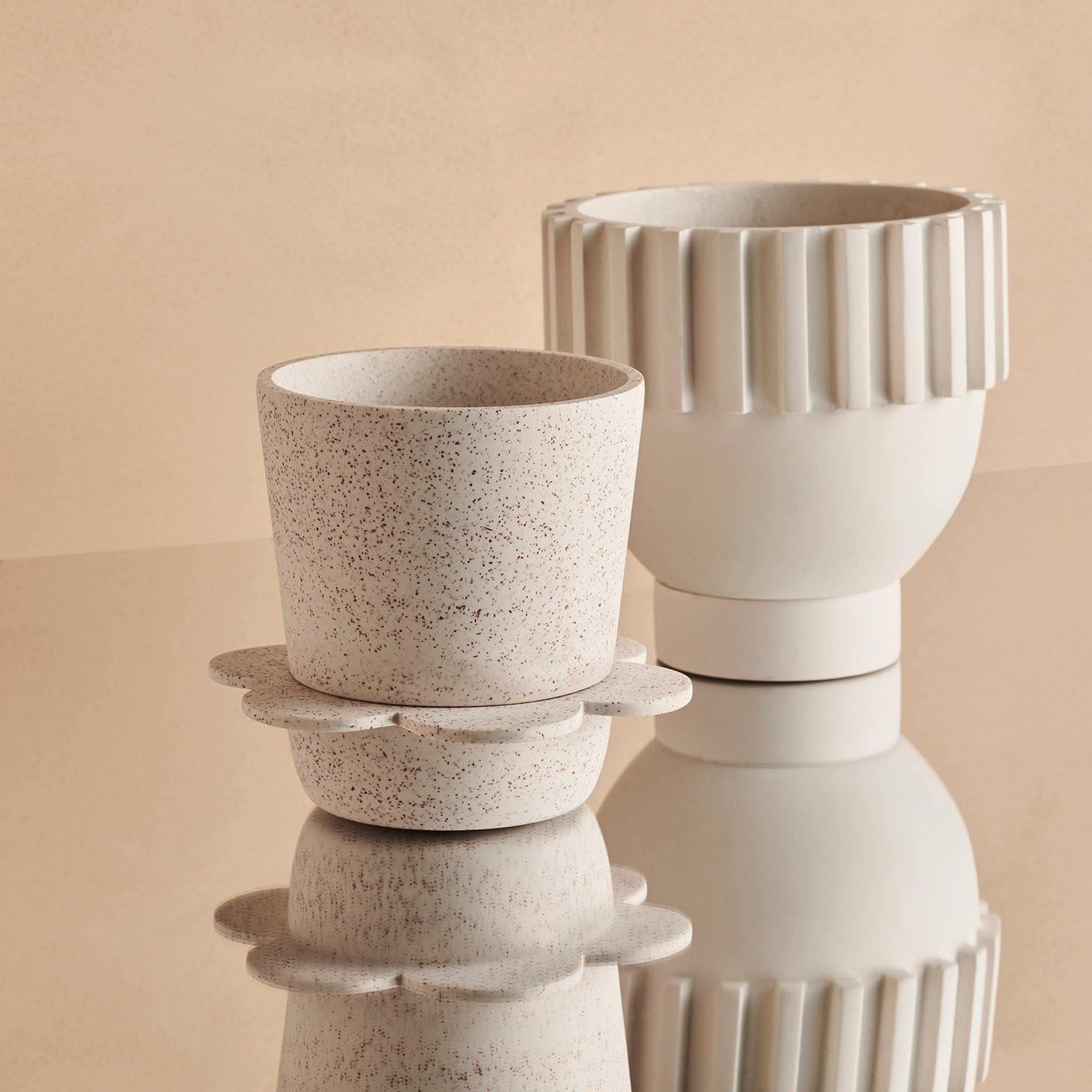
Crisp whites
If you’re looking to lean into the crisp clean vibes, can I suggest taking the edge off them with some neutral accessories. Toning down the crispness of the white can make your home feel more comfortable and inviting.
So we've tried our hardest not to be too biased towards warm colours but you like what you like.
If you take a look at our Back to Nature collection, you'll see the above reflected in our colour palette.