TRENDING COLORS
Nobody would deny us our love of color. While white planters and black planters are staples of the industry, we like to lift the envelope and find the latest and the trendiest colors to complete our existing collections.
Just last year we added our Musk collection to offer a subtle accompaniment to our salt and fossil planters, as well as a softening partner to our bold Golden, Terracotta, and Emerald pieces.
Here at Capra Designs, we pride ourselves on being at the forefront of the industry and we recently attended Maison & Objet to identify the hottest color palettes making waves this year. Here is what we discovered and how we incorporated it into our collections.
DESIGNER PLANT POTS DRAWING INSPIRATION FROM NATURE WITH MUTED EARTHY TONES
A blend of creams, light beiges, tan, and terracotta is contrasted by rich dark navy and stone in this striking balance of muted shades. Simple, elegant, and timeless, this look is perfectly executed below and is sure to be a popular interior design staple this year. Imagine dusk setting over a sand dune to get a feeling of the natural warmth this palette evokes.


Image: Maison Dada / Blomus / Honoré
Closely linked to the subtle gradients of nature, perfect this look by incorporating furniture and other decor crafted from naturally occurring materials. These tones are perfect if you are striving to craft a mature and sophisticated tone as opposed to bohemian or rustic.
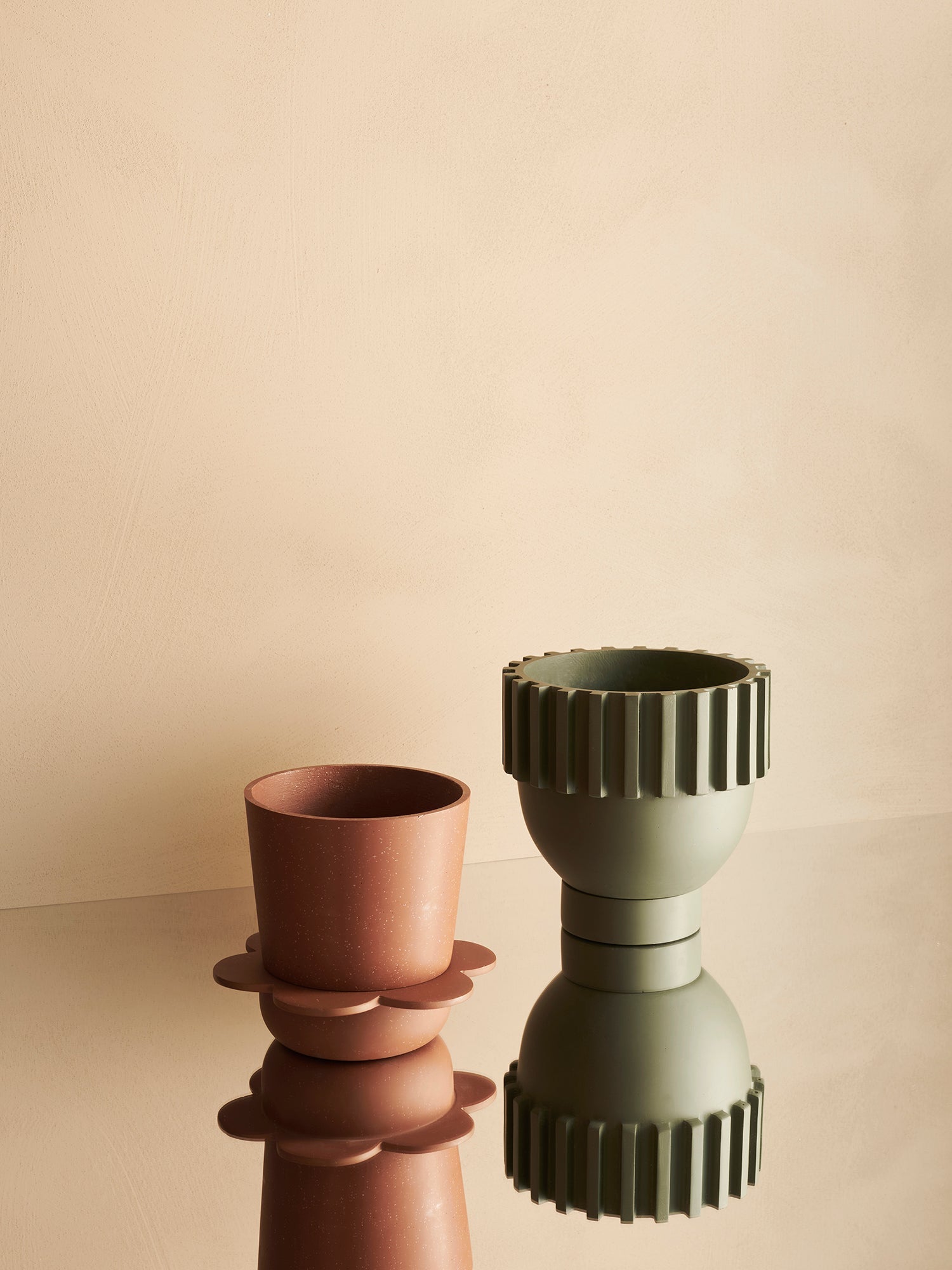
This approach is exemplified in our Roma, Spring, and Dome Eros designer plant pots featured below. See how the designs are inspired by the silhouettes of nature and handcrafted materials.
Capra Designs' favorites: a pair of Roma Planter in Fossil and a Dome Eros Planter in Terracotta or a Spring Planter in White/Agave Speckle.


INTERIOR DECOR OBJECTS THAT ARE BRIGHT, BOLD, AND EVOCATIVE OF THE VIBRANT 70s AND 80s
If the first trend felt a little restrained and bland for your taste, then this is surely the one for you. Bold, striking colors take a back seat to no one and this year proves that there is still a desire to return to the unabashed contrast and color of days gone by.
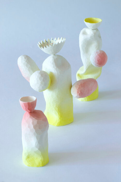
Picture rich oranges and pinks, purples, lilac, and healthy green hues. Nature can be subtle and elegant but she can also be bold and extravagant. See below for examples of color being used to bring objects and spaces to life.


Images: Uchronia / Studio Kartini / The Invisible Collection
To balance this abundance of vibrancy, sprinkle in some neutral tones and lighter textures. The above rug is a great example of how far a little restraint can go to balance peace and eccentricity.
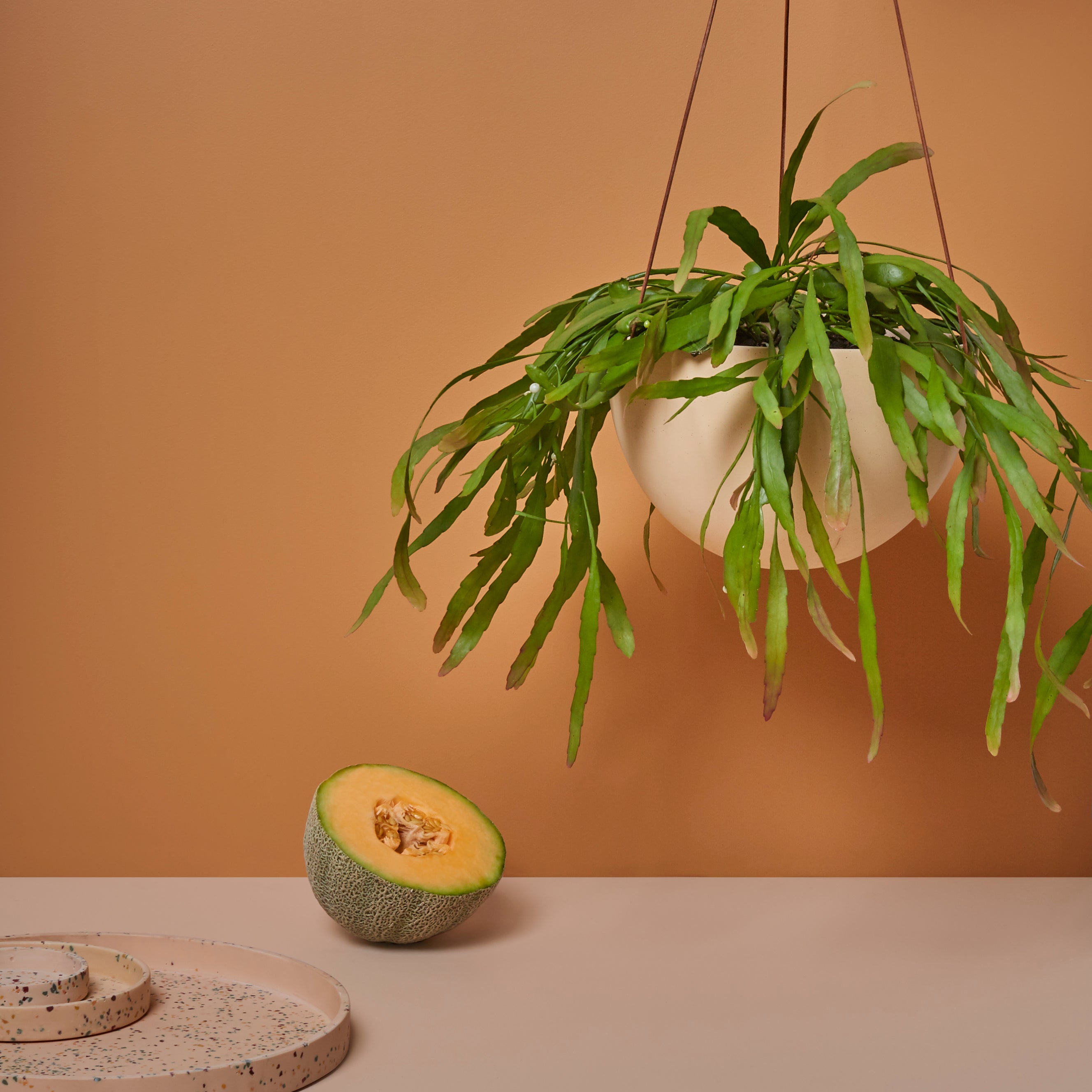
To truly capitalize on this trend and bring the whole aesthetic neatly together, we recommend incorporating some smaller interior decor objects. Our Golden Terrazzo and new Musk Terrazzo Archie Planters are bold examples of how color can bring a space to life.
Capra Designs' favorites: a duo of Archie Planters in Musk Terrazzo and Golden Terrazzo

To balance this abundance of vibrancy, sprinkle in some neutral tones and lighter textures. The above rug is a great example of how far a little restraint can go to balance peace and eccentricity.
To truly capitalize on this trend and bring the whole aesthetic neatly together, we recommend incorporating some smaller interior decor objects. Our Golden Terrazzo and new Musk Terrazzo Archie Planters are bold examples of how color can bring a space to life.


